RunStar Case Study

Client: Self Project
Role: Designer, Researcher, Strategist
Methodology:
User Interviews- Directed Storytelling
Wireframing
Information Architecture Diagram
Usability Testing
Prototyping
Tools: Zoom, Keynote, Sketch, Axure
The Problem at Hand
During the pandemic, physical fitness with an emphasis on running became a way for people to occupy themselves but due to the unwavering nature of unpredictable schedule changes, planning in these activities and sticking to training goals proved itself to be a challenge.
The solution
A running app that included customizable scheduling options pertaining to the users specific personal training goals.
Who are we talking to?
The user group used for this particular study were young professionals who were moderately experienced runners looking for a scheduling tool to maintain and track their running goals.
The Approach
Research:
Techniques: Directed Storytelling
Tools: Keynote, Zoom, Pen & Paper
Prototyping:
Techniques: Wireframing, Information Architecture Diagrams, Interactive Prototyping
Tools: Pen & Paper Sketch, Axure
Evaluation:
Techniques: Usability Testing
Tools: Axure, Keynote, Zoom
Methodology
Beginning with virtual directed story-telling through zoom interviews, three runners were asked a series of questions pertaining to their running goals. Through these stories commonalities arose in their desires. They all shared a common goal of tracking and scheduling towards their personal running accomplishments.
Beginning Steps
The first stage of this process was grabbing a paper and pen and sketching out simple layouts that addressed elements of the user goal. Research pertaining to preset goals and training programs were also included in these notes.These pages included a calendar, profile and settings option.
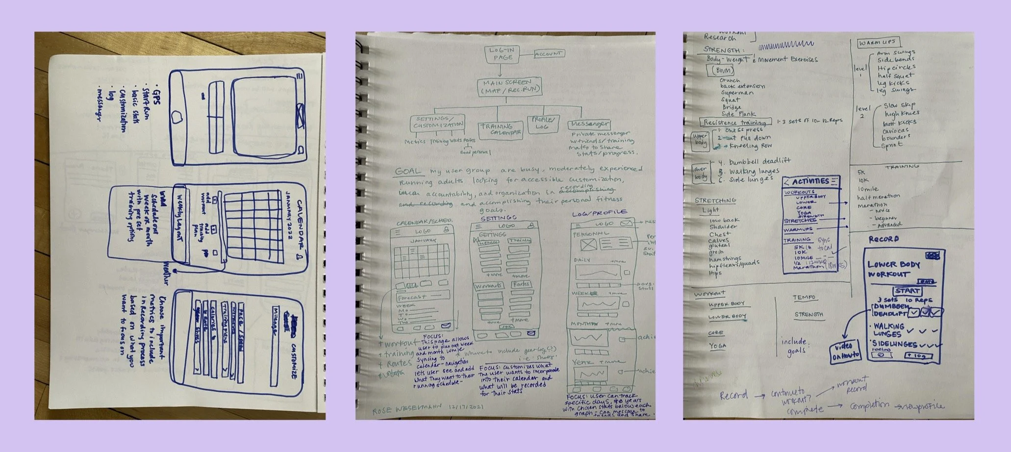
Wireframing
The second stage of the design process included jumping into Sketch and learning the lay of the land in a new design tool. Through curiosity and play, I was able to develop a series of pages that demonstrated this application’s user flow and varying capabilities all while discovering the benefits of digitally creating images. The exploration of hierarchy in the navigation process was initially addressed in this stage.

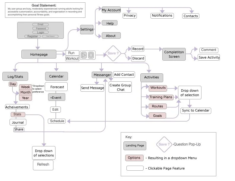
Information Architecture
Once the key pages were addressed, an information architecture diagram was developed to further explore the potential paths a user could take in their experience through the application.
Prototyping
This phase included the introduction of a new tool, Axure. This prototyping tool aided in expanding on earlier phase’s digital wireframes into interactive elements, putting the user flow architecture diagram into play. It was here where the application’s true functionalities came into fruition. At this point, there were selected pathways that were clickable for a user to interact and play with.
Testing and Evaluation
Usability Testing
Four users were asked to explore the Runstar app via Zoom and screen share and boy, was it revealing of some serious recommendations. Being the first usability test I’ve distributed, the takeaways provided invaluable suggestions moving forward.
The Process:
Each user accessed the app through a zoom call and were asked to dictate their thoughts and approached upon using Runstar. Specific attention was focused on:
1) Their initial thoughts on the purpose of the application upon landing on the homepage
2) Attitudes towards the user flow of the application
The Takeaways:
Usability testing among the user group demonstrated that Runstar held few strengths among several struggles. All users expressed confusion on the overall intention and goal of the app based on the landing page. All users believed the app to be more pertinent to GPS tracking and location specific items i.e nearby gyms or running routes.
Upon viewing deeper pages within the application, all users changed their initial thoughts of the applications purpose closer to its aim. Once users reached the calendar and personal tracking screens, they all expressed praise on how useful this would be in application to their running goals.

What’s Next?
The testing process was an enlightening and inspiring experience to better strengthen the applications flow. It opened new ideas that would encourage a more seamless flow by simply changing the landing page. This will further achieve understanding of what the applications main goal is; to maintain a customizable schedule. To address these weaknesses, the following steps can be taken to further strengthen the usability of Runstar.
1) A major point of confusion started with the landing page. By changing the homepage to a scrollable, option-filled page, rather than a record page, the user will have a better understanding that Runstar’s aim is to
better organize and plan out a personalized training schedule including
goals, routes, and stats.
2) Reconfiguring the navigations on both the main page and bottom screen will allow for a more intuitive flow in the users scheduling needs
pertaining to their goals. Increased emphasis on “Goals” and
”Schedule” pages rather than encouraging an initial “Record” option would
aid in this flow.