
BikeTag.io
Revision of an existing design for an interactive web application
Scope & Deliverables
Through contextual inquiries, user interviews, and usability testing, I digitized an interactive prototype for a responsive web application to accommodate the needs of those looking to participate in BikeTag.
Role: Researcher | Moderator | Designer
Methodology: Cognitive Walkthrough | Contextual Inquiry | Concurrent & Retrospective Think Aloud Protocol | Usability Moderation | Information Architecture Diagramming | Screen Flow | Affinity Diagramming | Data Synthesis | Sketching | Low Fidelity & High Fidelity Prototyping | Prototype Tour
Tools: FigJam | Figma | Google Docs | Zoom | Pen & Paper
Team: Natalie Lindquist | Jamie Tan | Kendall Van Horne
The Challenge At Hand
Think scavenger hunt meets geocaching meets social media, BikeTag is an interactive gaming experience for those who love exploring urban cityscapes using their favorite two wheels, their bikes. The rules of the game are simple; players are given a photo hint of a mystery location to find in their city. Using their bikes to travel to this mystery location, players compete against fellow cyclists to snap photo evidence that they’ve found the posted spot, bike to a new location for competitors to find in order hop into the game. Successful tags are accumulated under “tag names” adding to the competition.
Currently, BikeTag.org is the platform used to play the game and is accessed on a variety of devices, primarily the phones of those playing the game. Branching from the website, Stakeholders of BikeTag.io reached out to my team to construct insights and recommendations to develop a responsive web app that improves usability and accessibility for BikeTaggers of all kinds, including new and experienced players within a global reach. With this desire in mind, I researched the existing test site, moderated user interviews, and developed an interactive prototype based on my findings.
-
![]()
Primary Users
Biking enthusiasts ranging from casual to experienced degrees of cycling | New players looking to hop into a game of BikeTag
-
![]()
Secondary Users
Social Media enthusiasts looking to build community through interactive games


The Process
Cognitive walkthrough built out in Google and Keynote
Cognitive Walkthrough
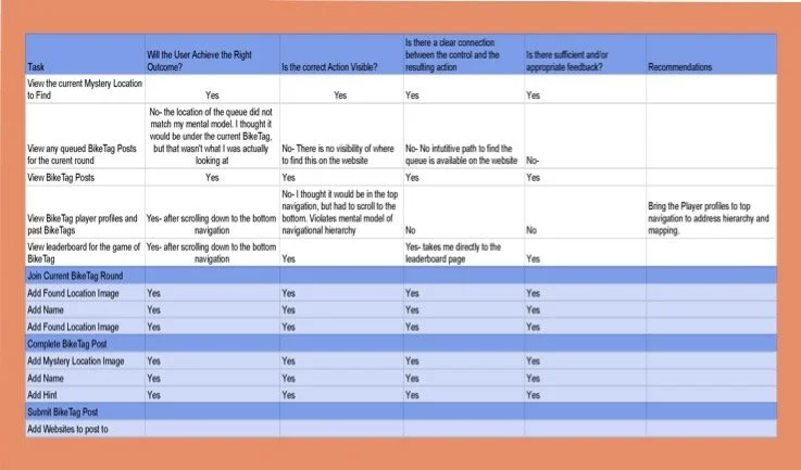
I was unfamiliar with the rules of BikeTag, so I began by researching the test application to learn the operations of the game. After gaining understanding of how the game worked, I carried out a cognitive walk through using the 8 primary tasks that the stakeholders desired their users to be able to perform. While navigating the site through these tasks, I kept the following 4 questions in mind pertaining to each task:
Will the user try to achieve the right outcome?
Is the correct action visible?
Is there a clear connection between the control and the resulting action
Is there sufficient and/or appropriate feedback?
Keeping key design elements in mind, including Mental Models, Hierarchy, Consistency, Visibility, Mapping and Feedback, I created a spreadsheet highlighting any pain points I experienced along the way. Whenever I encountered a task that failed any of the above questions, I noted recommendations to further research and presented them to my team to help guide us through the contextual inquiry.
Contextual Inquiry
Each person on my team conducted their own cognitive walkthrough. Once completed, we came together and evaluated commonalities that we wanted to address in our user interviews, including questions and observations we had while engaging with the current state of the app. We used affinity diagraming to uncover goals that we wanted to address while working with FigJam to sort these commonalities. It was from here we agreed upon and uncovered 5 main goals that we wanted to evaluate during our user interviews.
Understand motivations behind why participants bike.
Understand the degree to which bikers want to engage with the biking community via social media.
Understand the biking community and biking accessibility in the PNW.
Learn whether participants have played Bike Tag on this or other platforms.
Gain insights around usability of the BikeTag.io platform.
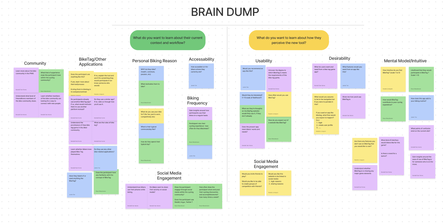
Affinity Diagram that helped in developing key goals.
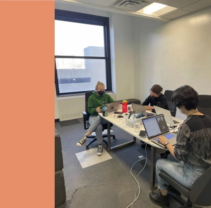
Usability Testing
As a team, we conducted two usability interviews with bikers in the Pacific Northwest leveraging both Concurrent and Retrospective Think Aloud Protocol. These interviews were conducted via Zoom over one hour sessions, where I moderated one session and took notes to share with my team during the other. It was here that we wanted to gain insights on the following:
Users motivations behind biking
Usability of the current iteration of the app
Users understanding of the BikeTag game
Through these interviews, I gained an invaluable collection of insight behind the rules and commonalities among those playing within the BikeTag community. Due to my lack of familiarity with the game and personal navigational struggles upon initially engaging in the site, it was surprising to observe how intuitive the app appeared to be for the users. Although both users were experienced cyclists, their desires and motivations behind biking varied from competitive to casual in how they interacted with the app. Overall, they shared the same pain points: The test app’s flow was clunky when it came to participating in the game. Other pain points were inconsistent verbiage and navigational cues throughout the interface.
Synthesizing Findings
After conducting these interviews, I assessed the findings in a FigJam board noting quotes and behaviors to uncover common themes and observations. These findings can be showcased through three user stories:
As a competitive BikeTag player, I want to quickly post a Tag so I can compete in a current game of BikeTag
As a casual BikeTag player, I want a hint for the mystery location so I can see who is currently playing
As a new BikeTag player, I want to learn how to play the game of BikeTag to play against the biking community
Through these user stories, I analyzed the current user flow using an informational architecture diagram and provided areas to improve the usability within the app . Leveraging the insights from my users as rationale behind the recommended changes, I sketched out low fidelity wireframes that highlighted key areas of improvement.
After synthesizing my findings, I constructed three user flow recommendations that could better enhance the usability and accessibility of the BikeTag interface:
By creating a login page with minimal required information and ability to agree to the terms of service and be remembered upon opening, the user can quickly jump into future BikeTag rounds.
Taking the submission flow down from 6 steps to 4 will increase the efficiency of posting to BikeTag.
Address the visibility of commonly missed features, such as the hint button.

Information Architecture Diagram of the User Flow
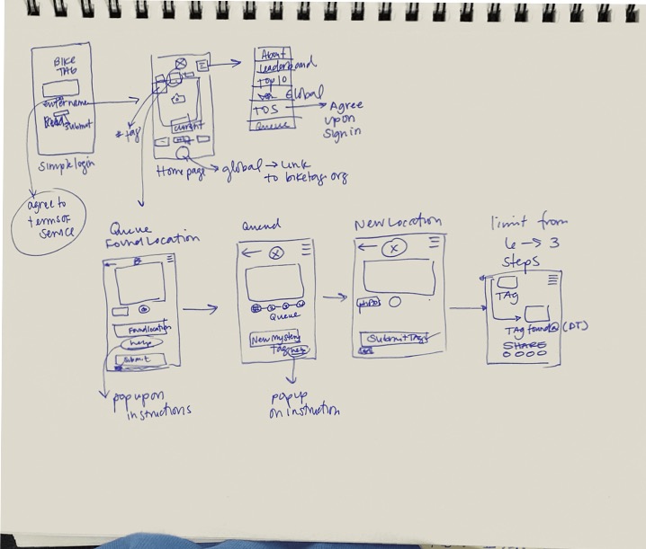
Hand sketched wireframes

Prototyping
I developed an interactive prototype based around user stories and scenarios that addressed each of these points
Building it Out
Through these user stories and recommendations, I developed an interactive prototype that walks the user through a new flow within the app.
A more efficient submission flow for competitive players
Intentional visual hierarchy and visibility for new players
Queue and profile for casual players
I created my prototype using Figma, where I was able to create purposeful interactions and flows to help improve the BikeTag experience. Once the prototype was complete, I presented it to my fellow peers and team members, providing rationale and understanding behind my changes and recommendations.
Conclusion and Next Steps
Learning about behaviors and motivations among those within the cycling community was incredibly insightful when it came to building out an updated interface for BikeTag.io. Findings demonstrated that cyclists enjoy game-ifying their experience in varying degrees of competition and anonymity. This posed the ultimate challenge of developing an app that can enjoyed efficiently by both ends of the cycling spectrum. My current prototype takes these personas into account by allowing the user to submit as much or as little information while improving the user flow to enhance the experience. Further steps include building out the leaderboard and player profiles, linking the application to a global reach through BikeTag.org, and minimizing the copy within the rules section to simplify the learning process and increase accessibility even more among new users.