
Exhibits
Development
Group
Comprehensive Usability Study
Scope & Deliverables
Leveraging findings from heuristic analysis and usability interviews, I designed recommendations to better improve the accessibility of an existing website.
Role: Researcher | Moderator
Methods: Heuristic Analysis | Usability Testing | Script Writing | Affinity Diagramming | Synthesis
Tools: Figma | Google Suite | Zoom | Keynote
The Challenge at Hand
About the Organization:
Exhibits Development Group (EDG) is a female-led organization specializing in the distribution of a diverse selection of high quality traveling exhibitions. Founded by Amy Noble Seitz in 2006, EDG is celebrating 15 years of providing cultural experiences with exhibits ranging in themes from the arts, science, history and popular culture for museums, cultural institutions and everything in between. Other services include support services for their clients, exhibit tour operations and custom exhibit design workshops.
The impact of COVID-19 curtailed museum going experience to a virtual world, and EDG consulted my team to improve the usability and efficiency of their website in order to connect, inform, and expand their client base.
To achieve this goal, I evaluated EDG’s current website to address existing usability issues. From there, my team and I developed a research plan to further identify pain points and areas for improvement. We conducted usability interviews with 6 participants via Zoom and further synthesized observational commonalities. Independently, I communicated these findings and prescribed improvement recommendations in a report for EDG.
EDG’s Goals
Help visitors identify which exhibition(s) they wish to have brought into their organization
Clearly communicate critical information about exhibitions, including size, materials, and logistics
Facilitate a connection between potential or existing clients with EDG staff.
Share available exhibition information and EDG services to create leads for the sales-marketing team
Who are the users
-
![]()
Primary Users
Museum curators | Directors of cultural institutions | Marketing staff at entertainment venues | Development, Operations, and licensing clients
-
![]()
Secondary Users
Press Media Members | Clients looking to recycle and up-cycle exhibit assets


Evaluation
What are the Problem Areas:
As it stands, EDG’s website provides a generous wealth of information for its users to access and enjoy. Consequently, this overload is arranged in an inefficient and unexpected way. EDG desires a website that will inform, excite, and connect users to all that this organization has to offer.
Evaluation Goals:
Evaluate the accessibility of exhibition scheduling possibilities to potential clients.
Assess how the user accesses the navigation to discover and understand services EDG has to offer.
Evaluate the comfort level the user has to contact the EDG
The Process

Heuristic Analysis
I Leveraged Jakob Neilsen’s 10 Usability Heuristics to assess my observations. Based on my findings and previous heuristic experience, I ranked the demonstrated tasks using a simple scale. Because I was working through an internal document, the information was simplified in an outline format to present to my team.
Demonstrated Heuristics
Moderately Violated Heuristics
Severely Violated Heuristics
Throughout this analysis, my brain was spinning with improvement ideas and suggestions that I incorporated into my findings outline. Overarching pain points and issues that I uncovered during this analysis were:
Inefficiency of user flower and navigation
Lack of clarity in information provided
Hopping into the Observation Room
After each conducting our own usability reviews, our team regrouped and evaluated commonalities among experiences and affinity diagrammed them using FigJam. We established evaluation goals to address these heuristic violations
-Evaluate the degree to which prospective clients can discover and understand services the organization offers
-Evaluate the degree to which prospective clients can discover exhibition ordering possibilities
-Evaluate the user’s ability to contact the company
Usability Testing
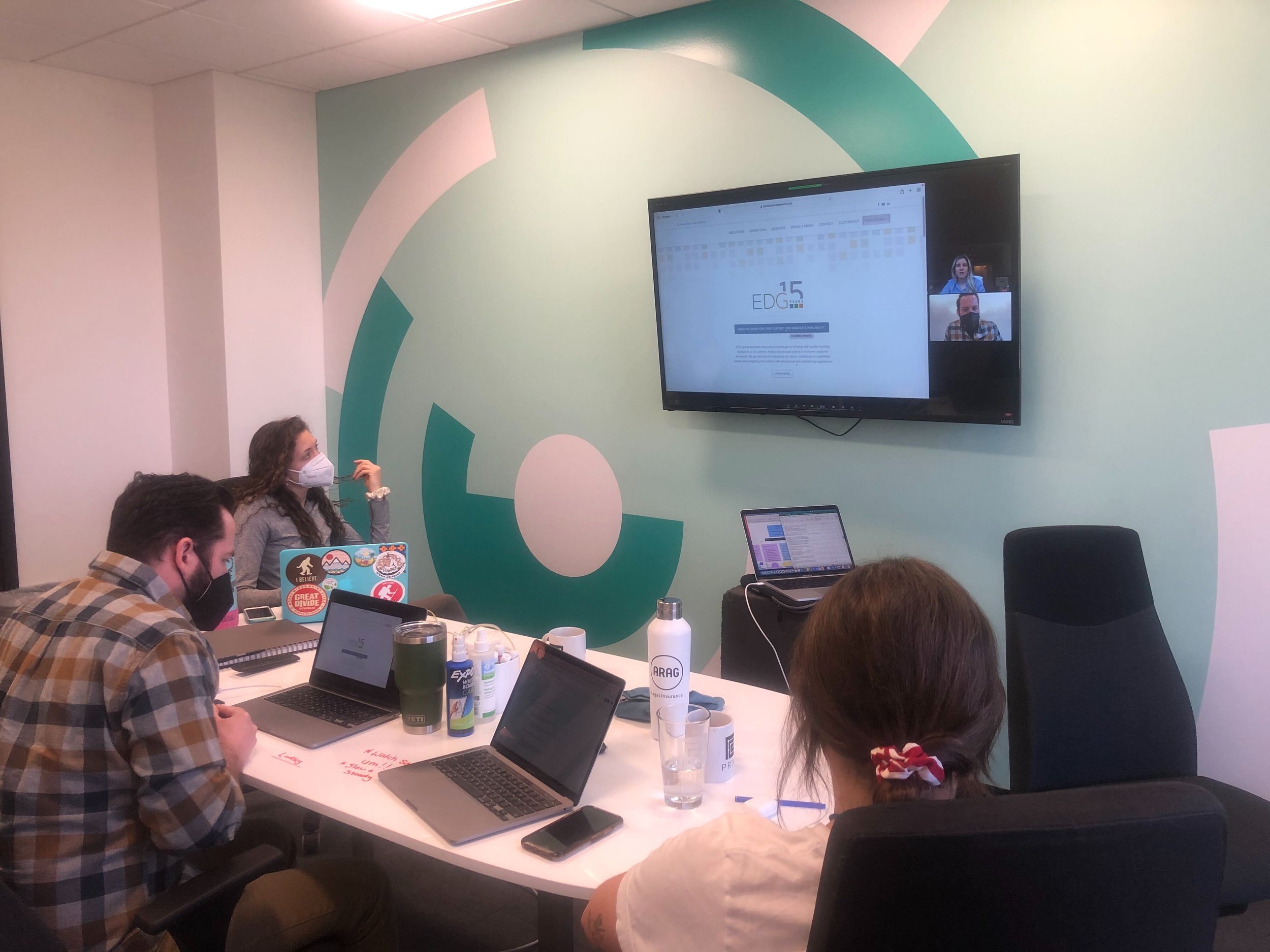
As a group, we brainstormed scenarios that would address these goals. Once we agreed upon these scenarios, we developed a script to present to participants (users) through 30 minute Zoom interviews using concurrent think aloud protocol, retrospective think aloud protocol and participant observation. I took roll as moderator for three of the interviews and observer and notetaker in the remaining three .
Upon completion of these interviews, we addressed commonalities among participant experience.. We further synthesized these observations and broke them down into categories based on: Homepage, Navigation, Contact, Services, and Exhibits
From here, observations and comments were included into the diagram and common themes and emotions arose. Independently, I synthesized further and uncovered overarching themes. Leveraging participant quotes, emotions, and body language, I evaluated usability recommendations and suggestions to better improve EDG’s website.


Findings & Recommendations
Leveraging EDG’s original goals as a guide, I created a thorough Findings and Recommendations report addressing commonalities among user findings and provided recommendations to improve these pain points.
Tying it all Together
Making sure to focus on EDG’s initial goals, I translated these themes into a Findings & Recommendations report to suggest actionable ways to improve the usability of the client’s website.
Research and interviews revealed that common pain points arose within the efficiency of navigating and understanding the website as well as establishing a trusting way to communicate and connect with EDG. This is where I chose to focus my recommendations. I came away with three key findings:
Finding 1: Navigation Inefficiency disrupts the user flow of accessing critical information
Recommendation: Integrating filters and distributing Dropbox information throughout the website will further inform the user on important touring and logistical information.
Finding 2: Improving Homepage Visibility
Recommendation: To heighten understanding and peak initial user’s interest, incorporate visual intrigue of exhibition opportunities and increase text contrast to appeal to accessibility and readability.
Finding 3: Improve Contact Form
Recommendation: Incorporate more subject options to facilitate trust and connection between initial users and EDG.
In my report, I addressed these findings and accompanied them with mid fidelity wireframe suggestions to demonstrate executing these opportunities of improvement.


Conclusion and Reflection
Although users were able to determine the purpose of EDG’s website, it consequently was not as intuitive as they would have hoped and rerouted the user in unexpected ways. Through usability testing, these observations came to light and I was able to construct recommendations that addressed the user flow, efficiency, and hierarchy of information displayed in order to further increase user accessibility and comfort in connecting with EDG and clearly display the plethora of services this organization has to offer. EDG was presented with the Findings and Recommendations report that thoroughly details these opportunities of improvement.